Blog 5
Responsive design has changed the way designers make website, but what are options are there for making sure a website works on a mobile device? What are their pros and cons, is there a specific situation where you should use one over another?
Published 1/08/17
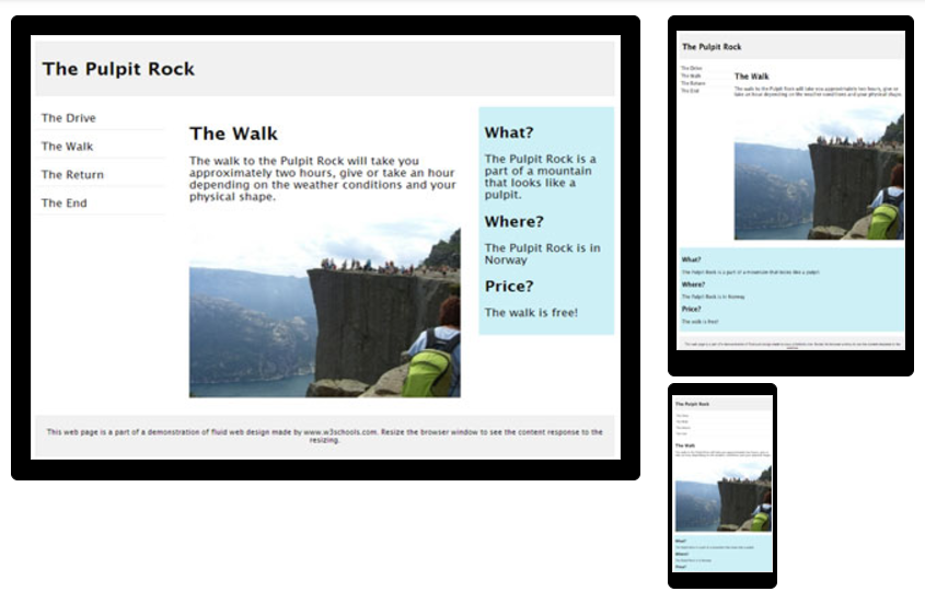
Responsive Web design is a method of approach to web design simply enabling you to adjust the webpage to whichever screen size of the browser or device viewed with, this by making your web page look more appealing on all devices including; desktops, phones, tablets, etc. This providing optimal viewing capability enhancing the viewers experience no matter the device use. By using HTML and CSS, this resizes, hides, shrinks, enlarges, and moves the content to fit the scale of the size of page you have altered the device to show. This image below shows the scale proportions in relation to three sized devices and how the content is moved to suit.
An example of HTML being displayed:
<!DOCTYPE html>
<html lang=”en-us”>
<head>
<meta name=”viewport” content=”width=device-width, initial-scale=1.0″>
</head>
<body>
<h1>Responsive Web Design Demo</h1>
</body>
</html>
With CSS of:
.city {
float: left;
margin: 5px;
padding: 15px;
max-width: 300px;
height: 300px;
border: 1px solid black;
}
The responsive website capabilities are a great improvement to the web, as viewers on a smart-phone would have to zoom into the content suited for a desktop sized device. By the addressed content layout of each device, the browsers, screen sizes, and orientations become flexible, fluid and adaptive to the device, which create media queries.
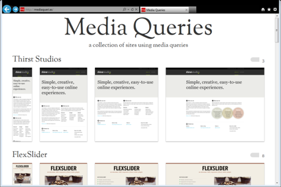
With the large (Desktop), medium (Tablet), and small (Phone) layouts of the Codrops responsive website, being demonstrated below:


Like everything on the web, there is Pro’s and Con’s to this responsive design layout. Pro’s include: being easily able to administer the website, as it is only one website suited for all devices with a single url, it has easy SEO and marketing with there being no need to create specific content for each device, and no extra work needed. With Con’s including: a possible technical problem with responsive design being relative new technology, as some outdated devices this may not work properly. User experience of a completely different experience on a mobile device compared to a desktop device.
Pro’s and Con’s for this experience of responsive layout design could include effecting the accessibility, speed, cost, marketing and SEO, maintenance, benefits, user experience, and visibility.
There is no rule for all businesses to use the responsive layout. If a business would like a separate website and app, they can. Or they could choose the responsive layout for all devices, as well as a native app in each of the OS app stores. But this option depends on the scale and budget of the business.
2017, HTML Responsive Web Design. W3schools. Available, Online: https://www.w3schools.com/html/html_responsive.asp
2017, Responsive Web Design. Available, Online: https://www.magicdust.com.au/responsive-web-design/
Ghazarian. A, (2014). Responsive Web Design vs. Mobile Websites. Available, Online: https://designmodo.com/responsive-design-vs-mobile-website-vs-app/
Commented On
https://designmodo.com/responsive-design-examples/#comment-1178822 [08/08/17]
 Bringing Thoughts to Surface